


What to Wear for Your Engagements
Planning Your Engagement Photos
When planning your engagement photos, follow these three steps.
Step 1: Determine the location and vibe you want.
Step 2: Determine the color scheme that complements you and your location.
step 3: Choose outfits, add texture, make it you.
To Match or Not to Match
Often we think that we have to be all matchy when it comes to photos. I tried really hard to find an old family photo but fortunately, its not on anyone’s social media. But just to give you some imagery, we were all wearing white shirts and jeans. I think it was a big trend in the early 2000’s. Do you know what I’m talking about? It seems like everyone was wearing basically that exact same thing. haha! But all I see when I look at that picture is 40 people with white shirts. A big blob of white. We want to avoid that. I’m not saying that wearing all white is a bad thing, it often looks really good. But instead of thinking MATCHY think COMPLIMENTARY.
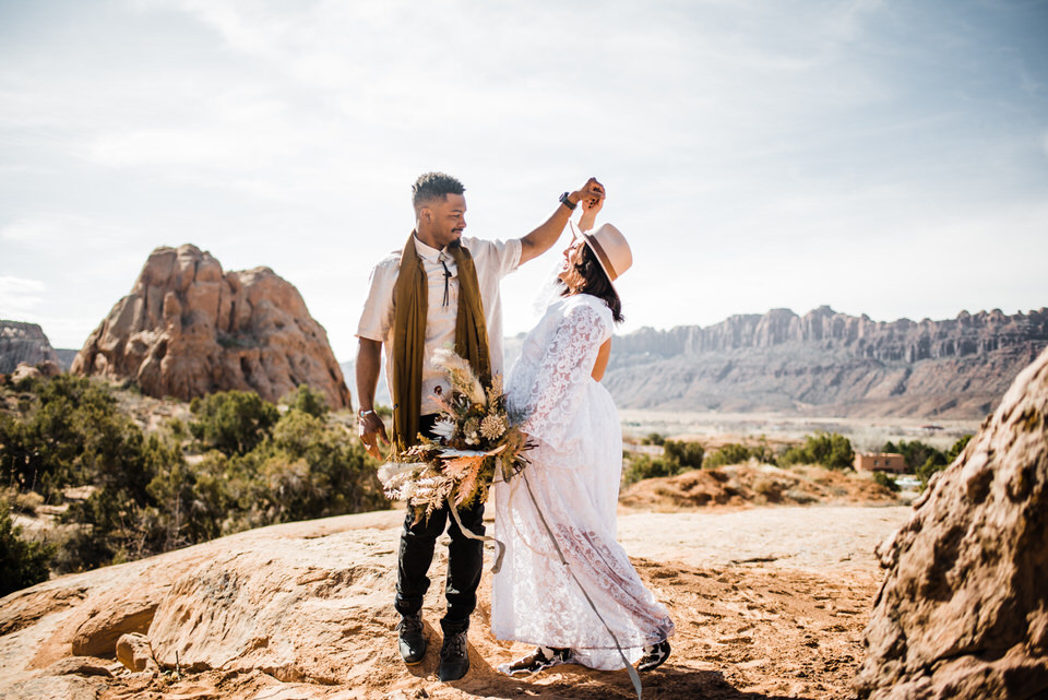
Complimentary colors: We want outfits to compliment each other and the scenery. It’s kind of a lot to think about. To break it down, just find a color scheme that compliments you and the location or time of year you are having photos taken .
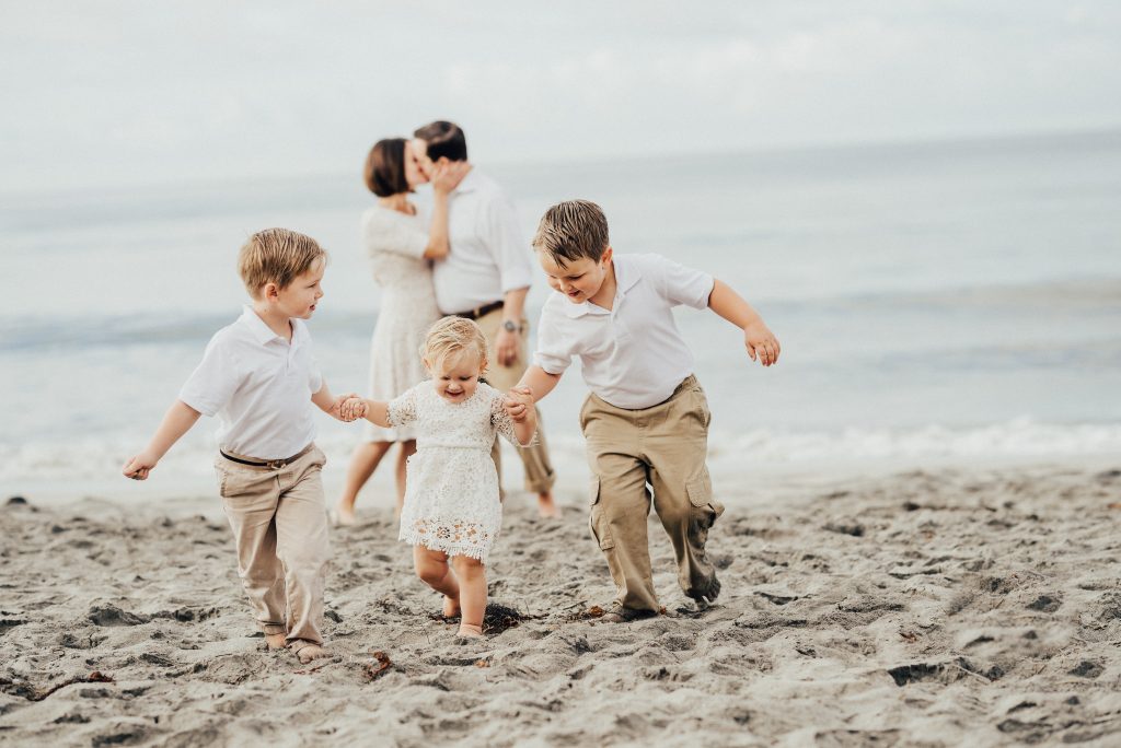
Take this family photo on the beach for example. They are all wearing white and tan and it looks good. Tans and whites, with a pop of light blue from the sky. It’s all complimentary and it looks really good. But I’m going to bet if they were in southern Utah with red rocks and green sagebrush and a blue sky… this combination might not be the best choice.
Textures
Spice it up with some texture! If you are keeping things natural, add some depth to your out fits by putting in some different texture. You will be surprised by how much it adds to a photograph.
Look at the littles girl on the beach’s lacy dress. It compliments her brothers’ shirts but is different and keeps it more interesting.
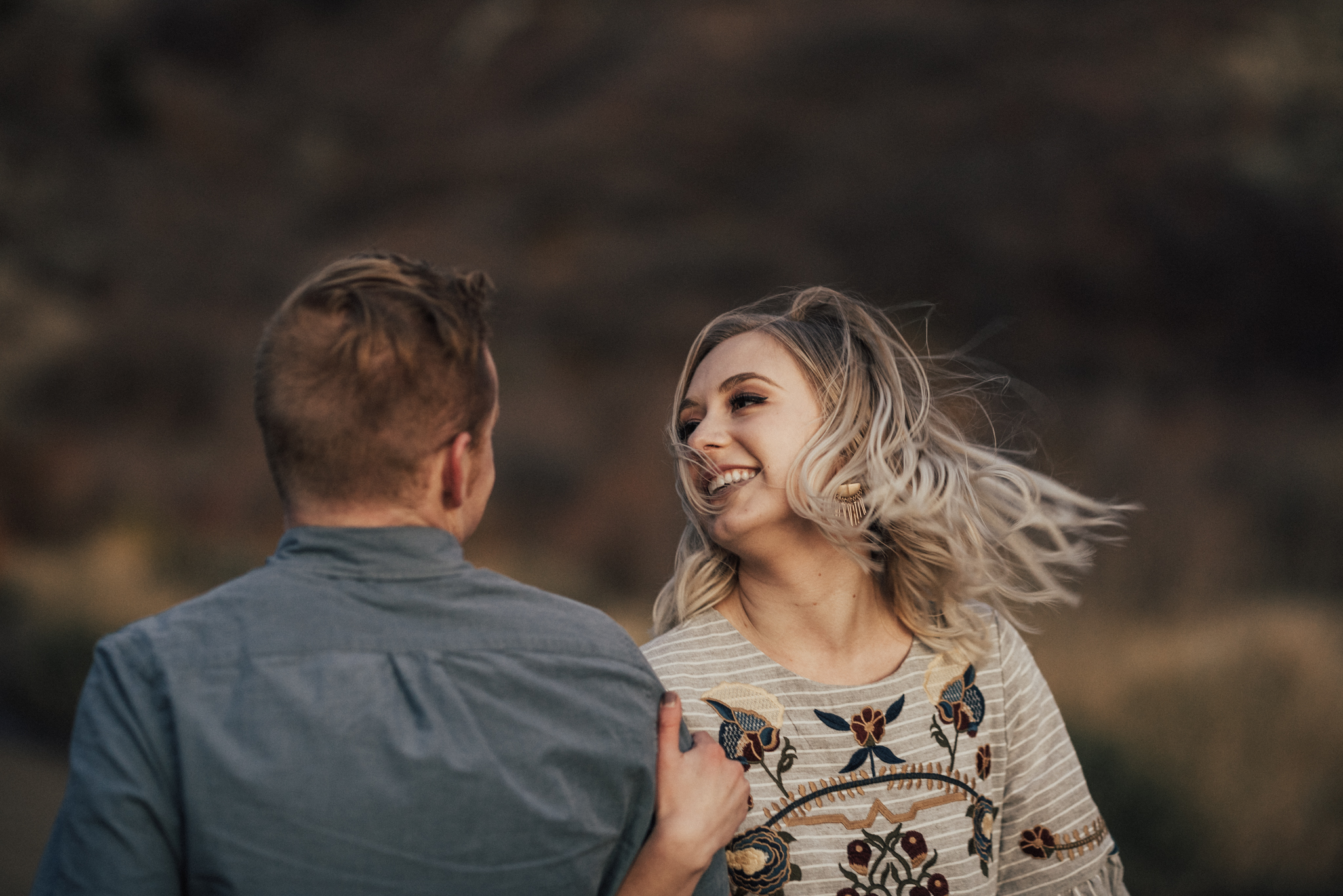
Now check out this babe’s sweater! So cute!
Naturals are always safe: tan, cream, grey, and brown. They compliment skin tones and don’t distract from what really matters… YOU!
It’s important to determine your photo style. Take into consideration what type of phots you like. If you like light and airy photographs, you will want to wear light colors, usually pinks and blues.
But if you are into the darker, richer photographs then you should probably avoid light pinks.
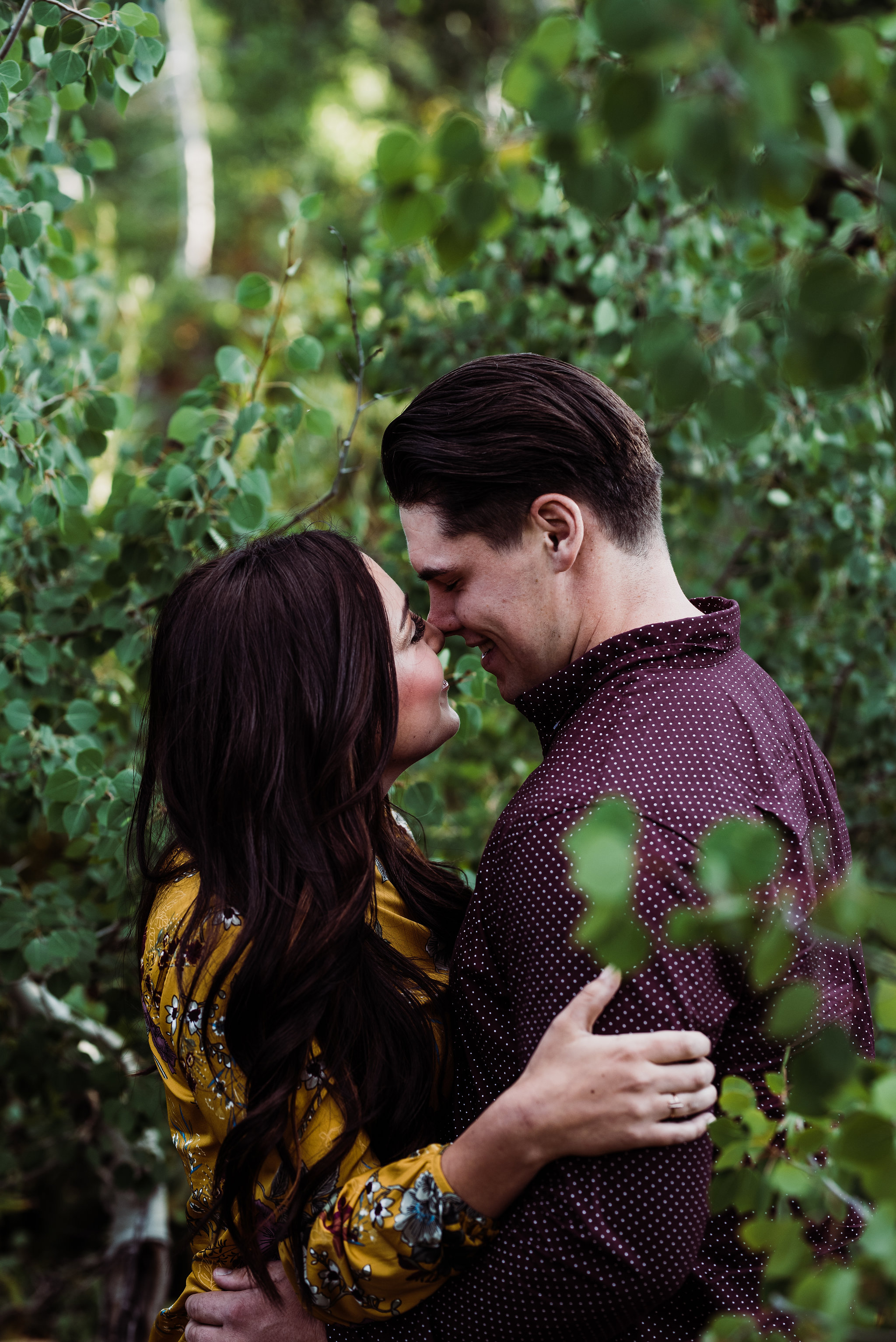
With my editing style, dark blues and greens always look good.

Things to avoid : Avoid logos, words, + any distracting patterns on your clothes. These all draw people’s attention off of you + onto your clothing.
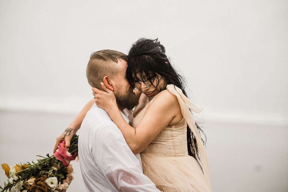
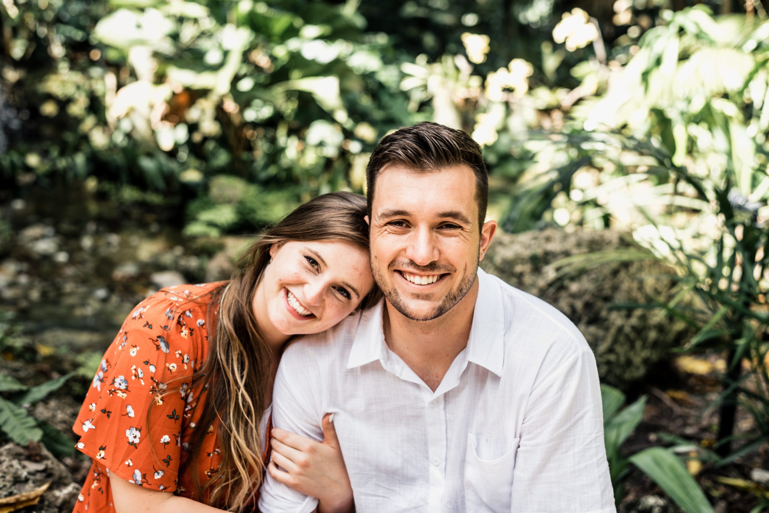
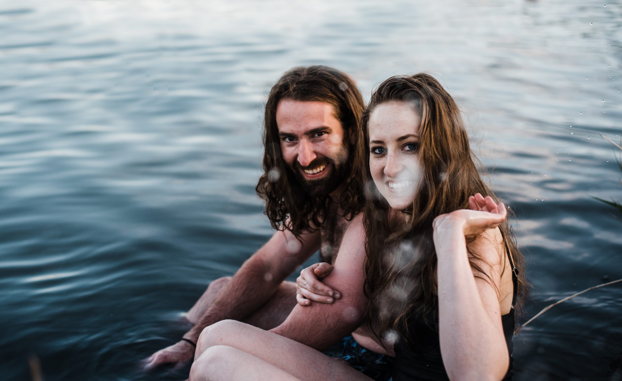
Make sure you are wearing something that you feel comfortable and confident in!

Previous Post:
Next Post:
I think you'll also love reading...
Living
Living
Style
Living
Living
Style
